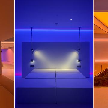
Since opening on the 17th of April, Espacio Iberia has welcomed dozens of guests with one thing in common: their infinite talent. Talent that has inspired all the people who have sat there to listen to them.
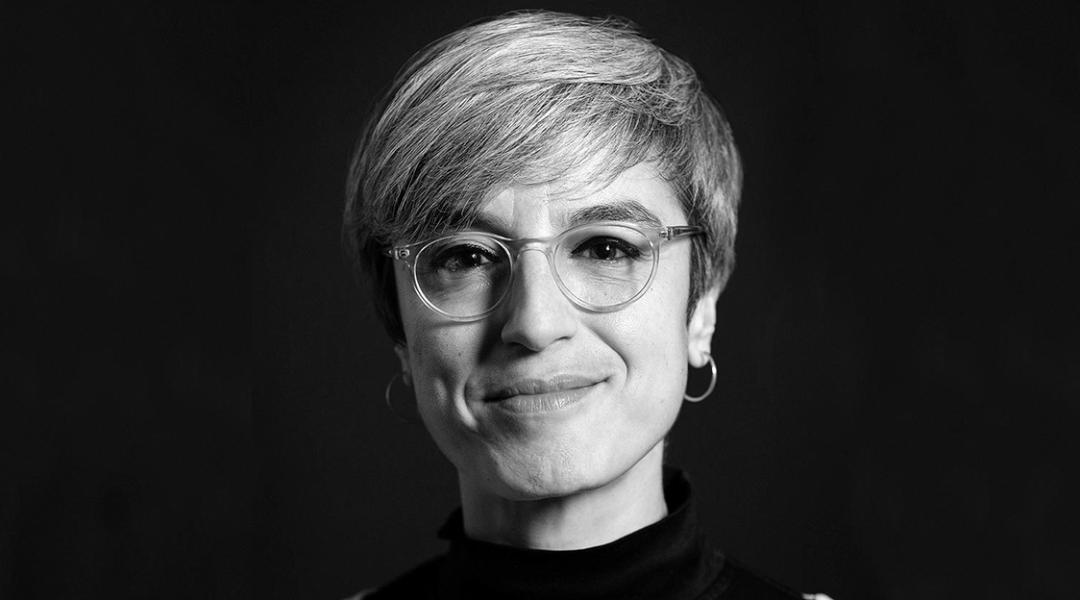
Have you ever stopped to think about the font you choose to write with and what it expresses? Laura Meseguer asked herself this question as a child and, over time, typeface design has become her life. With the same passion she dedicates to her job, she defends the value of fonts to communicate and convey emotions, and the talent behind those who create them.
We use letters to communicate. But depending on the font we use we can express very different thoughts or feelings. In fact, we’re most certain that this text wouldn’t convey the same if it were written in Bradley Hand or Algerian, which are radically different. Because typeface, as well as enabling communication, conveys emotions in itself. Type designer Laura Meseguer (Barcelona, 1968), a leading authority in this field after spending 30 years creating original graphic solutions for each type, knows this well. As well as winning the 2018 Gràffica Award “for —according to the jury— forging a path for the world of typeface in Spain”, her designs have received the recognition of the Laus Awards, created in 1964 to acknowledge talent in Graphic Design and Visual Communication, and of the Type Directors Club in New York, promoting excellence in typography.
Although most of us associate the art of typography to mechanics, specifically the invention of printing in 1440, it emerged much earlier, and the handcrafted, manual aspect of it, —which Laura likes to highlight—, has always been present. In the Middle Ages, monks specialised in handwritten typeface, copying volumes for nobility or the clergy itself. The greatest example is perhaps the Book of Kells, created by Celtic monks around the year 800 AD, with its highly ornamented fonts. A style that we still associate with Irish culture today. As it happens, in Spain we have another example of typography, Euskal, associated to a region: the Basque Country. The power of typography to bring together a population —another virtue Laura confers it— and give it an identity. Next to nothing. But where does Laura’s passion for fonts come from?
Her father and grandfather were printers, so, in a way, typography has always been present in her home. “From an incredibly young age —she remembers— I developed a taste for typography. It was a very passionate approach, and I drew types for pleasure.” What Laura didn’t know at the time was that this passion would turn into her profession. A Master’s specialised in Type Design at the prestigious Royal Academy of Art in The Hague represented a turning point in her career. Since then, she combines teaching at her own type school (Barcelona Tipo-g) with her personal projects, focused on researching type solutions and designing for national and international brands in the field of branding.
What is typography to you? How do you understand it?
As well as my profession, my passion, and my vocation, I conceive it as the cornerstone of design. We use typography to communicate, and, at the same time, it allows us to cover two needs: functionality, because it must be practical; and expression, because it enables brands to manifest a series of connotations and attributes. Typography is able to convey emotions and communicate by itself.
“My role models are people who figured out how to add their own unique identity to the types they drew”
Of the fonts that you’ve created, which is your favourite?
The romantic thing would be to say one that I haven’t designed yet. However, I’d highlight Qandus, which I created thanks to Typographic Matchmaking in the Maghrib, a project that I carried out in 2015 which consisted of developing an alphabet that would work for Latin, Arabic and Tifinagh script, the last of which is used by the nomad community in Northern African countries. It was a really special and thrilling challenge.
And one you’d never use?
My first font was Cortada. It’s really naïf and I’m fond of it, but I never use it.
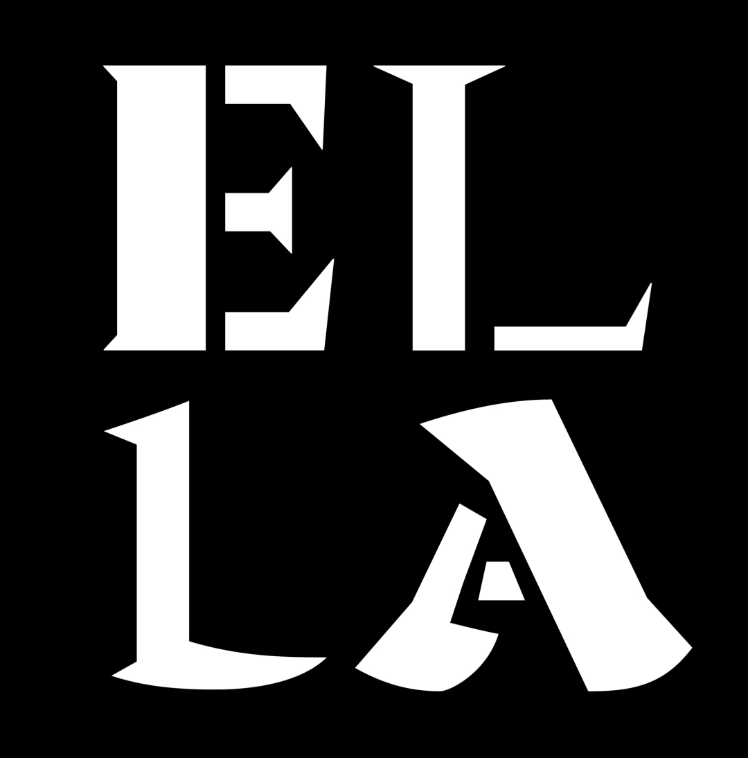
‘Ella’, a typeface family that connects calligraphy with the Stencil font (2022). © Laura Meseguer
Are there role models in this industry? Which are yours?
I have many. Looking back, after working in this sector for 30 years, I realise I’ve been influenced by really expressive designers like Herb Lubalin or Ed Benguiat, as well as the American school from the 1970s, and now I’d mention House Industries. Also, since I studied in the Netherlands, I have role models like Fred Smeijers, who was a professor of mine. My role models are people who figured out how to add their own unique identity to the types they drew.
Do you think that people in Spain grant typography the importance it deserves?
Until 30 years ago, typography wasn’t taught as a conceptual and supportive device, but rather as a simple tool for graphic design. Now, everyone understands that typography is essential and a fundamental pillar of design. The more people work in this field, the more type culture grows, but there’s still a long way to go.
“Now, everyone understands that typography is essential and a fundamental pillar of design”
It’s obvious that type design requires talent, but is it something innate or can it be learnt?
Type design can be learnt, you don’t need to be born with this talent to work in this field. What you do need is passion and curiosity, in the sense that typography catches your attention and inspires you to learn, delve into, and develop a taste for it.
Is the talent of type designers respected or are your creations copied?
Remixing is the order of the day, but the question is how someone makes a font their own, how they give it personality. Taking a type catalogue and applying it isn’t the same as tracing it. This shouldn’t be done, and it proves that that person doesn’t have any respect, talent, or anything to say. Type is a form of expression, and you should work in this field when you have something to bring to the table.
Finally, we’re going to make the most of your expertise. What does Iberia’s typography convey to you?
Iberia has a strong font that gives it a lot of weight. It’s a sans-serif typeface but with very quadratic and rounded shapes that play with aerodynamics and industrial design.
