Jorge Arévalo
Minimum Information, Maximum Personality
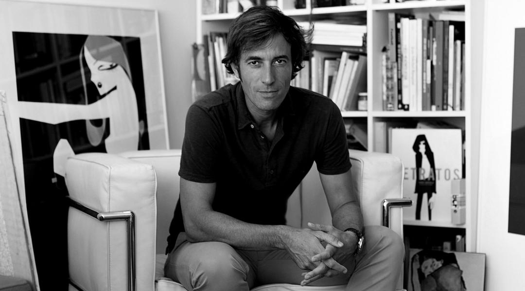
We have a chat with Jorge Arévalo, without a doubt one of the most important illustrators in Spain today. Creative and multidisciplinary like no other, the Madrilenian combines his gorgeous illustrations with an analytical mentality and a great capacity to communicate, which he applies in projects for companies like BBVA and Cartier.
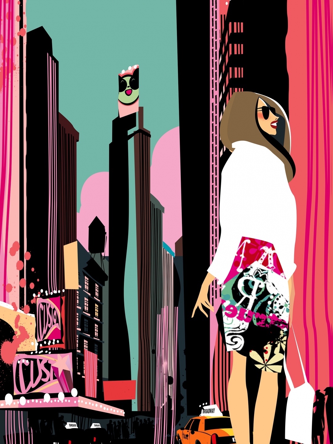
Jorge Arévalo (Madrid, 1968) became known illustrating characters for La Luna, newspaper El Mundo’s famous cultural supplement, in the 1990s. Since then, he has been working incessantly for some of the best national and international magazines, such as Vogue and The New Yorker, while in the fashion world he has been working side by side with Custo Barcelona since 2016. He has published several books, among which Retratos (‘Portraits’), for which he received the Daniel Gil National Editorial Design Award in 2006 and the Spanish Agency for Data Protection’s National Award for Best Illustrations Book in 2007.
How did you start in the world of illustration? Do you remember your first portrait?
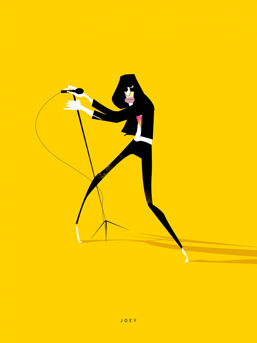
Illustration was always there. I complemented and enriched my designs with illustrations, but I didn’t really have a specific style. I was very comfortable illustrating movie or music characters, until El Mundo decided to give me a chance. Those publications earned me new customers and commissions. My work has evolved quite a bit since, but the essence remains the same. I don’t remember my first “official” portrait, but I think that with Joey Ramone, one of my first illustrations for La Luna, my style was defined.
You illustrate for numerous publications while at the same time working as creative and branding director for companies like Cartier, BBVA, and Bonnet a Pompon. How do you manage to combine those jobs?
The two realities coexist without problems, and if one ever crosses the other, it’s always enriching and nurturing. I believe that both fields have a common creative base that ultimately defines the result and the way of understanding the project.
“The final state of any illustration should be paper, print, physical contact”
You started working with Custo Barcelona in 2016. How did that come about? What do you think it does for you?
When Custo saw my first book, Retratos, he fell in love with my work, which was the start of an endless string of collaborations. Custo brought much more freedom to my work, my style has become fresher and more carnal. My drawings became more explosive, more Custo. It is most definitely of the essence that a client trusts and gives you as much freedom as possible in order to successfully finish a project. With Custo, everything is great in that aspect.
How do social networks influence your work?
With Instagram I started late, and I was sceptical. At first, my work didn’t really fit those small formats for quick consumption. It’s true that I’ve had to adapt some content to Instagram, but rather than it being a problem, it has enriched my work since there is a lot of feedback and you’re in direct contact with the new generations.
Why did you self-publish your first work?
In 2005, design books were all the rage, wonderful and expensive. There were incredible books available from anywhere in the world. I thought my illustrations would go greatly in one of those books, so I designed a draft that I sent to the relevant publishers who, in turn, systematically turned it down. One after the other. As in those days the budgets for illustrations were incredible and the wages at the agencies were generous, in a flash of pride and reckless self-esteem I decided to publish it myself. And in style, of course!
Digital or paper?
The beginning was analog. I was already illustrating by hand before the Mac era, and I still always miss paper—that’s why I need to put on exhibitions and publish books: to make my work tangible. I think that the final state of any illustration should be paper, print, physical contact. If an illustration only exists in digital form, as is usually the case on the internet, it won’t last in the end.
Your illustrations have a lot of personality and a very striking colour palette. How would you define your style?
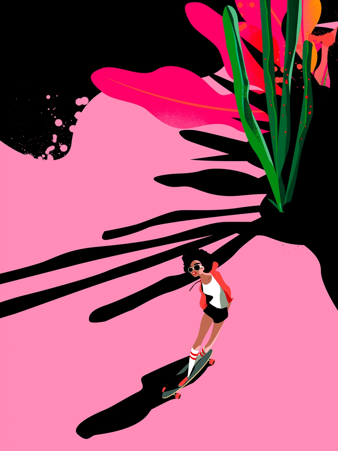
My work is not minimalist, but I do try to synthesise the forms in an elegant way and at the same time be able to play with very baroque textures. I always think of an illustration as a cover; I try to give it the power and design needed for it to have a lot of consistency. With regards to the colours, I have my episodes, but yes, inevitably, there are some that are dominant. Black is always present—it is the colour that reinforces the liveliness of the others.
How do you focus each portrait?
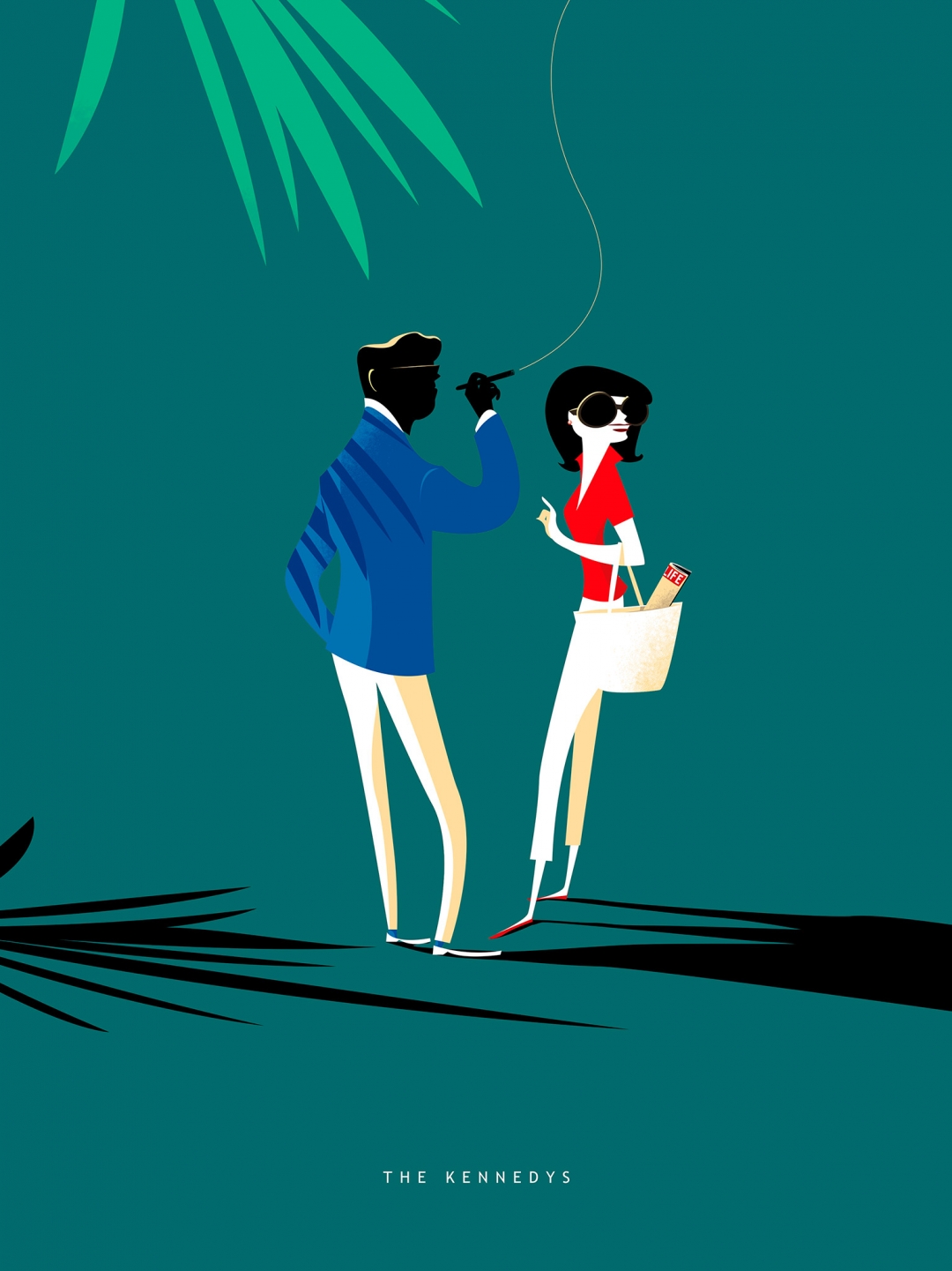
I try to get to the character with as little information as possible, and synthesise them without losing their personality. Giving them personality and placing them in the exact context is important—sometimes an insignificant detail can make all the difference.
Are there any characters you always get stuck on?
I always have a hard time with Sarah Jessica Parker. I find her very attractive, but her particular physique always gives me a lot of problems, and it can’t be because I haven’t drawn her hundreds of times. (Laughs)
