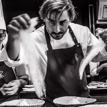
Labourer of acting
Álvaro Gago, the director of ‘Matria’, chases Ramona with his camera in a frenzied story that has earnt actress María Vázquez her second Goya nomination.

Vega Hernando, best known as Eating Patterns, has turned the kitsch movement, graphic surrealism and food into the three pillars of her photography. With a crowd of followers on Instagram, this designer and art director publishes her first book about recipes and patterns in March.
Designer Vega Hernando (Barcelona, 1990) says that, upon opening her @eatingpatterns account on Instagram, where she shares her personal universe of colours, recipes and perfect patterns, she received the first call requesting an interview and five photos. At the time she only had two images to send, so she had to let her innate talent run wild. Where others only see a boiled egg, an avocado or a sardine, she makes edible geometry in her head. Therefore, turmeric, squid ink or beetroot become the perfect dyes for her pieces. What started as a personal project has taken on the dimensions of a photography studio with work for big brands, content creating, online courses and gastro-photography experiences. Trained as a Textile Designer at BAU Design College in Barcelona and with self-taught photography training, Hernando has achieved an unmistakable style, which in March will spring from social media into her first book: Eat! Cocina de productos que se come por los ojos [Eat! Cooking products that are a feast for the eyes] (Lunwerg Editores).
Two things: my passion for design and for beetroot in the kitchen: I love how it stains everything pink! When I finished university, I worked for several years for big brand suppliers, making graphic fashion prints. But there came a time when I felt overwhelmed, I left that big company and continued designing on a freelance basis. I started to search for a way to bring together design and gastronomy, which is my other passion. I love planning dinners at home, having my friends over, returning from my travels with a suitcase full of spices and new recipes that I cook and serve taking aesthetics into consideration. I wanted to express myself through cooking and give it my spin as a designer, and that’s where it all began.
Everything started as a personal creativity project, to share with friends, something very naive, with no ambition. I wanted to explain recipes graphically and when I opened my Instagram account, I received a lot of feedback, interview requests... From there I was offered the chance to make a print with food for a brand and I thought that could become a job. I looked for a way of monetising this and several projects emerged as an art director, always related to cooking.
At the beginning I took photos with my phone, because for Instagram you don’t really need much more than that. The concept, the story you want to tell, and the composition are more important. I teach a Doméstika course which focuses on the DIY philosophy, to encourage people to take photos with minimal resources and a homemade natural light set, like a window. If you have a reflex camera, great, if not, your phone will do. My sister lent me a Canon EOS600D and that’s what I started with, almost always with a 18-55-millimetre lens, because to take overhead shots at a short distance you need a short lens. I took the photos at home, it’s very bright in the morning; on cloudy or rainy days I wouldn’t work, and I waited for the next sunny day. I played around with flash photography a bit, but the project grew so quickly that, once I opened the studio, I preferred to collaborate with excellent photographers such as Anne Roig, who has taken the photos for my first editorial project, Eat!
It has something for everyone. I think it can be summarised as a book to prepare aesthetically pleasing recipes at home, which are also simple. It’s the kind of book you buy because it’s beautiful, but also because it teaches you something. At the end of the day, I’m no chef, I work on content creating and art directing. Perhaps it may seem difficult for a newbie, but it comes naturally to me: I can place the ingredients following a proportional logic. I always try to make an initial sketch, to explain the idea to my clients, in terms of colour range. But the final composition is intuitive. Everything comes down to shapes and colours.

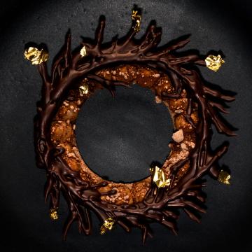
Eating Patterns doesn’t only refer to ‘food habits’; it’s also the name of Vega Hernando’s culinary project. © Anne Roig
We’re becoming used to eating avocados year-round, when really, they should be a luxury product! I’m a fan of using seasonal, local ingredients, in a more logical and sustainable way. I focus on cooking fresh, unprocessed products from local shops, with a small environmental footprint. That’s what the book’s about; an ode to the products of each season. I think this is knowledge that is disappearing, that popular know-how that traditional market sellers have that responds to the question: “What can we eat in February?”. In the end, any act of consumption is a political act.
It might not be at the foreground anymore, but at the beginning I was really interested in the Memphis movement; Italian design with geometric shapes. At that moment in my life, it really inspired me: crazy, very graphic prints, with a surreal touch. I was interested in Nathalie Du Pasquier’s work. I still like the kitsch aesthetic, with complementary colours like red or pink. I take many liberties, even with clothes. I combine purples, oranges, yellows... Although over time, I’m not sure if it’s because I’m becoming more serious or plain, I’ve started do use ranges of one colour or two.
For me, my role model for using food as a concept is the magazine Toilet Paper, which somehow represented the beginning of using food as a part of communication, with a somewhat ironic point of view. For example, they took photos of a bath full of spaghetti. These are ideas that come up often in advertising. In the end, I believe that the secret is to take particular care of the graphics and the technique, and let the food do the talking.